2025 Winner
1st Place Graphic Novel
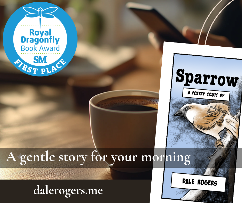
Discover the transformative power of resilience and grace in “Sparrow” by Dale Rogers. This unique poetry comic book blends evocative imagery with the lyrical beauty of verse to take readers on a journey of self-discovery and introspection through the eyes of a sparrow braving the elements.
Chapter 1: The Comic
Immerse yourself in a visual narrative that soars beyond the confines of the page. Each panel, rich with color and emotion, illustrates the sparrow’s tale—a metaphor for the human experience, confronting and embracing life’s inevitable winds of change.
Chatper2: The Poem
Experience the poem in its pure, textual form, providing a different rhythm and pace that allows you to absorb and reflect on the layers of meaning. This section invites you to delve deeper, offering a new perspective on the themes explored within the illustrations.
“Sparrow” is not just a reading experience; it is a meditation, a silent conversation between the reader and the page. Perfect for fans of graphic novels, poetry, and anyone who finds solace in the stirring dance of words and images.
Read Webtoons
